ILLUSTRATIONS
Airbush, Pencils and Ink


CP Rail, in an effort to boost morale, released an EP record of employees singing songs that characterized their involvement in the field or on the train. I recognized the musical note on its bars could translate to a wheel on rail. I created the cover and the inside record design. Air brush and ink on illustration board.
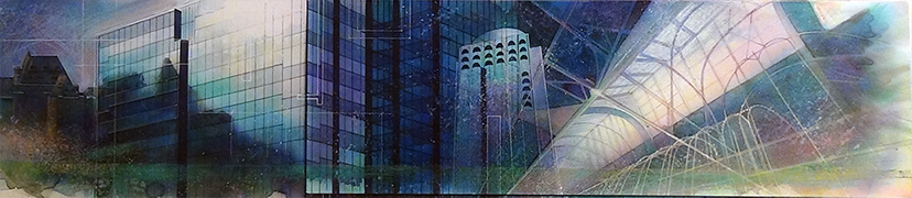
A folder explaining the successes of CP Rail in the world market required a graphic that would be a companion piece. The timing of this folder was when PCs were becoming common in the offices of the average employee. The older monitors still had "scan lines" so I decided to incorporate them into the illustration to suggest the relationship between the railway, the world and computers. Airbrush, acrylic and ink on illustration board.
CP Rail would give proposals to customers, stakeholders and lobbyists, they needed a cover to their documents that didn't appear "intimidating." I created this simple airbrush illustration of a 3/4 view of a locomotive. Airbrush and ink on illustration board.
This illustration of the Château Frontenac was for an in-lobby Spectralite display of all the hotels CP owned at the time. Pen and ink on illustration board.
The final Spectralite display for CP Hotels. I used two colours to keep costs down and added negative space on the right side of the display to help balance to flow of the display. 144"x108" placed in lobbies of CP Hotels across Canada.
CP Rail magazine article about computer viruses. I wanted to be playful yet engaging. This article was written before anti-virus software was freely available. Acrylic on illustration board.
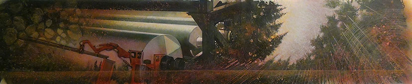
To build the tunnel through Cheops Mountain and Rogers Pass, two companies were brought in to dig from opposite sides. Using a laser to ensure accuracy in tunneling, one company used a "mole" and the other a digging head and explosives. This illustration was created for the CP Rail Report, a weekly newsletter that was delivered to all stockholders, customers and stakeholders. Acrylic on illustration board.
In order to make transporting commodities through the Rockies less expensive and time consuming, CP Rail decided to build a tunnel through Cheops Mountain and Rogers Pass. This illustration for their public awareness campaign was to show how the impact on the environment would be minimal and where the proposed tracks would lay. Acrylic on illustration board.
CP held annual Christmas parties, this was an invitation to such a party. The black lines and logo are on an acetate allowing the negative strippers access to the full artwork before adding the lines and logo. The breaks in the lines were to allow for an illustration of mistletoe. Graphite on bond paper.
A brochure detailing how CP Rail's boxcars are configured to allow for air to pass between boxes, yet show how wood was placed to help prevent shifting of the commodity. Airbrush on board.
An illustration showing how CP Rail's boxcars are configured to allow for air to pass between boxes, yet show how wood was placed to help prevent shifting of the commodity. Airbrush on board.
Cover illustration for the CP Annual Report, when CP still owned many companies, there was a requirement to highlight each division with an image to help separate the Report into individual sections. This is one of seven illustrations. 36"x12" Ink, chalk, acrylic and airbrush on illustration board.
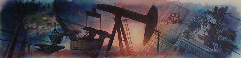
Oil and Gas illustration for the CP Annual Report. 42"x12" Ink, chalk, acrylic and airbrush on illustration board.
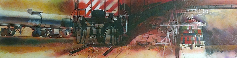
Trucks, trains and ships for the CP Annual Report. 42"x12" Ink, chalk, acrylic and airbrush on illustration board.
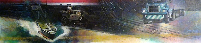
Ships, trains and trucks for the CP Annual Report. 42"x12" Ink, chalk, acrylic and airbrush on illustration board.
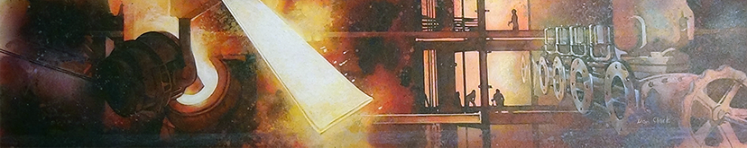
CP used to make its own rail through its subsidiary Algoma Steel. This is the illustration for the steel mill section of the CP Annual Report. 42"x12" Ink, chalk, acrylic and airbrush on illustration board.
Montreal, Ottawa, Calgary, Quebec City were just a few places where CP owned hotels. This illustration was created for the hotel section of the CP Annual Report. 42"x12" Ink, chalk, acrylic and airbrush on illustration board.
Here is the section of the CP Annual Report the utilized the illustrations. Designed to be a top bank to highlight and reflect the information.
Forest Products was a big component of CP holdings. Note at the right a view point that E.T. the Extra Terrestrial had of the forest at the beginning of the film. Note also the tree rings to help sell the idea of pulp and paper. 42"x12" Ink, chalk, acrylic and airbrush on illustration board.
The Forest Products section of the CP Annual Report.
CP Rail introduced the personal PC to be supplied to each of their employees to work on. This was in the days when computers weren't as common and people were still generally apprehensive. The illustration was to show employees that NASA was currently using computers as daily office equipment., and so could they. Airbrush and acrylic on illustration board.
The accompanying article which features the computer in space airbrush illustration.
CP customers were constantly seeking where their shipments were in Canada. CP added Telex and TWX to their locomotives to help pinpoint the location of the trains carrying their commodities. I broke up the copy into three columns, making the mailings relatively cheaper utilizing a standard no. 9 envelope. The train is an airbrush illustration on board.
Selling CP Rail's ability to move lumber from not only a hub, but from a spur built into the paper mills' backyard would save on transportation costs. I created this piece with a die-cut saw that lifted out of the airbrushed wood and folded open into the information detailing what it would entail to have a spur brought to customers' property. Airbrush on board.
Illustration for an article on CP Rail building its network across the prairies. 1884 was a time of steam trains and livestock. I wanted to bring that era in with the cow skull and train. The wheat on the right is light enough to carry paragraphs of black text. Alkyd on watercolour paper.
CP was helping farmers get their product from silo to processing facility. Management felt it was worthwhile to talk directly to the farmers to address their concerns, so the "Grassroots" program was created. In this illustration for the CP Rail Report magazine, I connected the Sales Team Agent to the farmer in the field. Alkyd on illustration paper.
A retirement card for a CP Rail executive in the train handling department. It was his job to align how cars were set onto a train to help expedite which cars were uncoupled first at which yard. He worked exclusively in Montreal and handled French customers. Coloured pencil on board.
William Van Horne was the pioneer for CP Rail's beginnings. An article in the CP Rail Report detailing Horne's involvement required an illustration. I left the left side of the illustration clean for all the text that would overlap the image when the story was published. Alkyd on watercolour paper.
Roger Robinson worked in CP Photo Services and was a huge golf fan. He spoke many times of the sand traps he was able to get out of, so... Here is painting of him in a huge sand trap (check out the greens and flag at the top left hand side). Airbrush and acrylic on water board.
Nicolas Morant gained world fame for his photography. Canadian Pacific regularly used his talents when adding photos to our photo library. The day came when he decided that he was going to retire. It was my responsibility to do his "retirement" card. Coloured pencil on watercolour paper. Note the CP train in his lens. His wife commented on how I had captured him to a "T."
Employees retiring from CP Rail were given a farewell card from their department. Because of my strong ability to render portraits, the responsibility fell to me to create the cards. I averaged about 5 cards per week on top of my regular graphic designer duties. It was not unusual for me to work at least one 24 hour day every second week. Watercolour on rag illustration paper.
Part of the President's Message safety campaign, 12 safety posters were developed, each focusing on a different aspect of yard/road safety. This illustration was concentrating on Personal Protective Equipment (PPE). Graphite on illustration paper.
The President's Message safety posters each carried a unique theme. Personal protection on one's own time was the focus for this poster. Graphite on paper.
CP Rail required many safety posters under the campaign of "The President's Message." This one shows the value of 3-point contact, minimizing the risk of falling if you always had three parts of your body on the train. Airbrush and ink on illustration board.
The President's Message safety campaign focused on 12 unique safety issues. This illustration showcased the need for clear communication and following the rules. The text on the poster helped to drive this point home. Graphite on drawing paper.
Original illustration for the book "Dark of the Moon." Two girls time-travel back to the days of the Underground Railway. The "ghost" of the African-American was one of the characters these girls accompany on the railway. I balanced the house, grandmother and girls in a triangle as to make the eye move from right to left to down. The large moon gave ample room for the title. 24"x18" acrylic on board.
Book cover illustration for unpublished book. "Letters from War" was to be published by Roussan Publishers, but was pulled near publication date. Watercolour and ink on watercolour paper.
I was curious what a black and white oil painting would look like. I liked the pattern on the model's shirt and had fun rendering it. The light in his palms was created from a long exposure photograph where he is holding a small birthday candle, which, incidentally was the sole source of light in the photograph. In the end, I added colour to the eyes, they are brown. 24"x36" oil paint on illustration board.
I wanted to try a second black and white oil and I liked this photo of a young lady I took. The right eye half in shadow attracted me and I wanted to render it. Her facial expression showed such mystery. 24"x36" oil paint on illustration board.
The Genesis Theatre Group mounted a musical based on the the children's book "The Legend of Redwall." Since the book dealt with talking animals, I thought it would be fun to draw the actors in costume. Note the "Bugs Bunny" ears on the middle actor. The eyes on top belonged to the antagonist Cluny. I found later that Cluny had an eyepatch. I fixed that for the posters, programs and T-shirts. 36"x36" airbrush, coloured pencil on board.
The final poster for the Legend of Redwall. The main antagonist, Cluny now sports an eyepatch though my original illustration was missing the detail. I added it as a coloured pencil illustration on paper, cut out and attached to the original painting.
The Genesis Theatre Group required an illustration for their upcoming musical "Kings and Things." The open banner in the middle would contain their play's title and the space in the green below would contain the location and dates. 10"x12" acrylic and airbrush on illustration board.
Inter-City Video added the Jazz Broadcast Editor to their line of video-editing products available to customers. This editor was ahead of its time as it could pixelize and reverse colour on any video. I painted this image to capture those features. I had cut all the boxes and photos and glued them to the artwork for seamless colour separation. Acrylic on board.
Inter-City TV utilized many illustrations in their TV Times Magazine ads. This is a judge's gavel. Airbrush and ink on illustration board.
Inter-City TV was caught up with the new Star Trek - The Next Generation show craze and wanted their new ad to carry a science-fiction feel. I created this spaceship bringing Inter-City TV products to a foreign world. Air brush and ink on board.
Inter-city TV rented plenty of appliances and required many illustrations of their products without the manufacturer's name. This wooden CRT console was a big seller in the 80s and 90s. Airbrush and ink on illustration board.
Inter-city TV wanted to sell the concept of "Movie Night at Home" so I created this airbrush illustration with enough bands to place copy. The top banner was inspired by the opening sequence to Star Wars. Airbrush and ink on illustration board.
Airbrush illustration for Inter-City TV. The concept was to "design your kitchen" with appliances, so I made the illustrations unfinished and on a grid. Airbrush ink on illustration board.
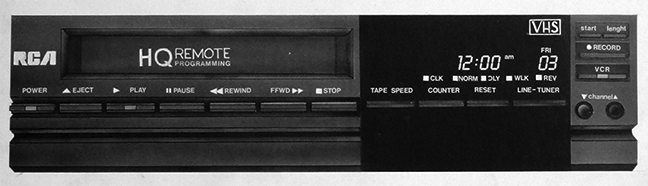
For Inter-City TV, the RCA company couldn't supply a really good high-resolution image of their product for an upcoming ad in a timely manner. This illustration became the base image for most of Inter-City TV's future ads. Ink and airbrush on illustration board.
Using a TV and VCR to breakthrough the page of the TV Times magazine helped echo the "Price Breakthrough" headline. Airbrush and ink on illustration board.
Inter-City TV needed a simple graphic that could be used on business cards, folders and hand-outs. I drew this simple generic illustration of the different products they offered. Ink on illustration board.
I wanted to experiment with illustrating on a textured stock. This is my daughter Tara as a one-year old baby. Coloured pencil on textured stock.
My daughter Caitlin was having a nice time playing with a garden hose on our driveway, I decided to make it a stick, sort of to bring her back to nature. 8"x8" coloured pencil on illustration board.
Tara was photographed by my wife playing with a stick near a small creek. I liked the colours and how her face showed such happiness. Coloured pencil on illustration board.
The source photograph to my coloured pencil illustration of my daughter, Tara.
Illustration of my children when they were 4 and 1 years old. Pencil on gessoed masonite.
Janus Academy needed a mural on their front office pillar. The need was to make it colourful and simplistic for the students.
The Janus Academy (https://janusacademy.org/) is a school that specializes in teaching autistic children. The grades rum from elementary to graduation.
The mural is meant to show several curriculum that is offered by the school. The challenge was to represent those subjects visually. The bottom portion of the mural (the blue part) was intended to be a solid colour, incase the paint got damaged by shoes or backpacks.
59 - 59
<
>