LOGOS
Hospital, Corporate and Book
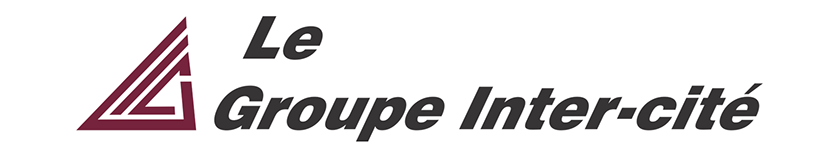


The need for this logo which was to be the umbrella company of all its subsidiaries, was to have an icon that could be used without the words. The slanted triangle, if you look closely, is a stylized I, C and G, this would also fulfill the requirements of Quebec's language laws (Bill 101) allowing the icon to be used with both, English and French versions of this logo.
The front of the Le Groupe Inter-cité building with the logo I created.
Inter-cité TV original had a logo that was built from a common font, I redesigned it with at stylized TV screen with at TV swish, a drop shadow and a font of my own design. The letters were originally hand drawn on illustration board at 500%, this way, when it was reduced to final size, it was very sharp. I had to re-draw the font to accommodate the vehicle wraps.
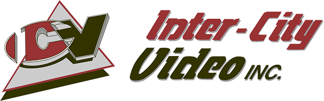
Inter-City Video wanted a logo that echoed the triangle of the umbrella company "The Inter-City Group." I overlapped the ICV eventually cutting the I out of the C to give it a uniform look. We decided to use a Pantone colour for the red to keep printing costs down. The lettering was of my own design and hand drawn on illustration board.
Inter-City Group created a company that specialized in office automation. To keep consistent with the other entities of the Inter-City Group, I designed more letters from the font family I created. The PD from Panadata is based on an old computer punch card, I then divided them into the two mirrored letters, P and D. I kept the same Inter-city red as to keep the look uniform.
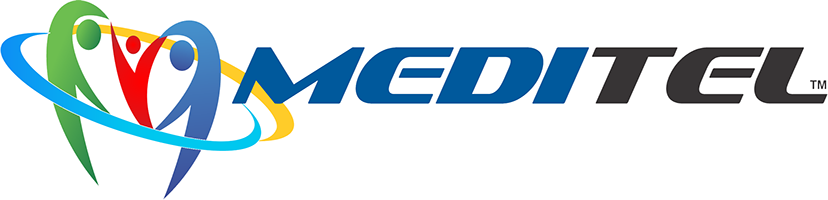
Hôpitel needed a second entity to handle their healthcare network. Keeping the "tel" from Hôpitel, Medi was added to create Meditel. I used the same Pantone blue from Hôpitel and added the universally recognized heartbeat and placed it into a Eras Ultra, a very thick font that could be easily read in any size.
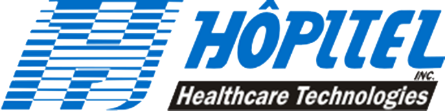
The Inter-City Group created a new entity that would service hospitals in Quebec. They named it Hôpitel based on the French word hôpital, changing the "a" to an "e" thus rendering its association with television. With this in mind, I created a stylized "H" in the shape of an italic TV screen and used the TV's scan lines to define the "H." As to be uniform with the other corporate logos, I created new letters from the font I developed.
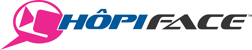
As part of a family of services, the name "Hôpi" would tie all the services together. Hôpiface is a service that allows the patient to connect via video to their family and doctors.
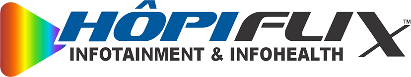
HôpiFlix is the in-hospital service that allows patients to watch films or research information regarding their health.
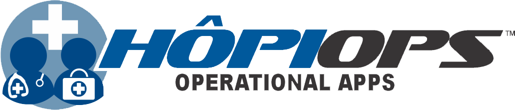
HôpiOps connects doctors/clinicians to operations.
HôpiTV connects the in-hospital patient to television shows.
HôpiMed is the in-hospital portal to all the offered digital service applications.
A refreshed logo for inter-cité Médical.
The front of the Hôpitel building bearing the logo I created.
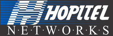
Hôpitel decided to make an offshoot for specific hospital needs. They created the entity Hôpitel Networks. I used the same Hôpitel logo as it was already recognizable and looked like it belonged to the source group and took the Pantone blue and blended it into black to help add contrast to the text. Networks, to me, was a bunch of servers creating the whole, so I broke the work up into little pieces separated by "server" dots to reflect its reality.
Hôpitel wanted an icon that would lead their clientele to their new website. I used the internationally recognized "H" for hospital and three bands to unify the text to the "H" to make it a whole logo, rather than floating elements.
Hôpitel introduced the ability to monitor patients from their bedside screens, enabling the doctors/nurses to respond if an immediate emergency situation arose. I used the Hôpitel blue and the familiar heartbeat. The circles represent the connection from the patient to the camera
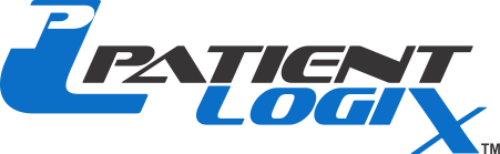
Hôpitel moved into an exciting new direction, creating an interface for patients in hospital and for doctors across hospitals. Hôpitel needed an entity and logo for their American market, so using the same Pantone blue, PatientLogix was created. I integrated the P and L to make a stand alone multi-mark if needed.
PatientLogix became part of a larger umbrella company, Patientel Networks. I used the same Pantone blue, giving the logos a visual connection to the other Hôpitel entities and the same font at PatienTel. My thought was that Hopitel was going to expand into differnt countries, so I used a globe and a stylized "P" for Patientel.
Digital Security diagnostics wanted a logo that was to emphasize Security. Here, I made the S larger and in a second colour to help it stand out. I then used the logo to be part of a box that encompassed the letters, thus making it a unified whole as opposed to a bunch of floating elements.
Inter-City Group branched into security and found a market for apartment dwellers who wanted to keep track of their laundry in a secluded room from their apartment TV. Cameras were set up to see the washing/dryers and a code allowed them to see their laundry on a unique TV input. The same Pantone blue from Hôpitel was used, scan lines representing a TV screen and a unique font to separate it from the parent company.
CommonSense Computer Consulting wanted to to advertise they set up networks and computer infrastructure. The cabling seemed like a logical course to create the "C" in the company name and "lan" cables and USB connections were prevalent in the business.
CP Rail created an internal department whose sole responsibility was to work with the farmers across Canada. These farmers grew wheat, canola, barley, durum, and other grains that required special attention. In the logo, I put in our locomotive, a combine and a grain silo. I used the three primary colours as to indicate that with the three components, there wasn't any issue we couldn't resolve.
Roussan Publishers created a line of Young Adult Novels that didn't take place in our time and place, the "Out of this World" brand. I created the logo in Lightwave 3D and utilized a rocket to let the target audience know that there was some element that took them from this plane of existence.
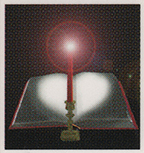
Roussan Publishers expanded into religious books which they called "Beloved Books." I designed this logo in Photoshop, I used a candle in the image as they are prevalent in religious services and with the curl of the book pages, the light made a natural heart shape.
The Railway Hockey Association required a logo for their tournament being held in Calgary. I used the Calgary Tower in the background. The hockey stick lent itself beautifully for the "L" in Calgary, and the cowboy hat lent itself to a stylized "A." I used the CP Rail red for the second colour.
The Railway Hockey Association required a logo for their tournament being held in Calgary. I used the Calgary Tower in the background. The hockey stick lent itself beautifully for the "L" in Calgary, and the cowboy hat lent itself to a stylized "A." I used the CP Rail red for the second colour.2
13 - 27
<
>