CORPORATE DESIGN
Corporate Profiles, Products and Hospital Bedside Interfaces
Corporate design focuses on dispensing information. There are minimal limitations on content.


CP Rail safety poster on obeying all the rules while in the yard. Numbers are large and coloured to bring attention the the "5 Alive" branding. Assembled in CorelDRAW.
Association of American Railroad Safety Conference in Montreal. I used the loose look of the Montreal street artists for this one and chose recognized places in Old Montreal. Watercolour on board.
CP Rail brought various dignitaries to Banff for the Council of the Federation. This booklet design was used on all promotional materials. Logo created in Adobe Illustrator.
When Canadian Pacific changed its logo in 2012, we needed to change the patch of the Canadian Pacific Police. I tried to balance th logo with the departmental designation. There are French and English versions of this patch.
CP Rail needed a clear system map that communicated all of the intermodal terminals available to customers. I felt a simple line drawing with the terminals displayed as diamonds and port terminals displayed as yellow stars would help the clientele easily identify which terminals were handy for them. Assembled in CorelDRAW.
A mailer spotlighting our service in moving potatoes within Eastern Canada. I used a cartoon bag of potatoes as railcars to catch the eye of the prospective client. I reasoned that if we could illustrate how important the moving of their commodity was to us, then then would trust us with their product. For legal reasons, I blurred out the rates for this webpage. Pen and ink on board.
The CP Rail Report is a weekly newsletter sent to customers, stakeholders and potential clients chronicling the effort we put into optimizing our business. Loaded with Company history and technological developments, this colourful newsletter kept the audience informed. The design breaks the stories up into easily accessible parts and helps to focus on the stories at hand.
Usage of an alkyd illustration in the CP Rail Report newsletter defining the concept of "Grassroots management."
The CP Rail Report center spread. Colour is used liberally throughout to give the newsletter a "fresh" feel and to help separate the stories to make them easily accessible. The many photographs are used to make the newsletter look less "stiff" and more of an enjoyable read. This is created in CorelDRAW.
This rulebook cover spotlights what is important on CP Rail's lines. The Canadian government regulate the rules, CP Rail then builds the book for the conductors and locomotive engineers to utilize. Created in CorelDRAW.
A sample inside page of the CROR book. Two column setup to help move the eye and break up large paragraphs of text. the gray bands help separate the headings from the rest of the body text. Tables and charts to clarify how the rules should be interpreted. The section designation on the outside left of the book helps to move and identify the sections within the document when flipping pages. Created in MS Word.
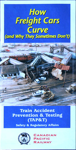
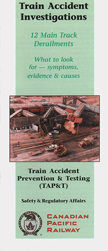
The need for legal protocol was the genesis for this pamphlet document. When a derailment happens, specialists from the Safety & Regulatory Affairs department would go on-site and investigate the derailment cause. Proper documentation is paramount for future prevention and for all legal considerations. This design shows the aftermath of a major derailment, the textured colours were to echo the organic nature of metal.
CP Rail developed a series of pamphlets designed to explain the reasons for some derailments, reasons that could show how to avoid such accidents. "Stringlining" is such an example, the pamphlet shows that trains going around curves would rather travel in a straight line than a curved line, so care from the locomotive engineers' control would reduce the risk. Created in CorelDRAW.
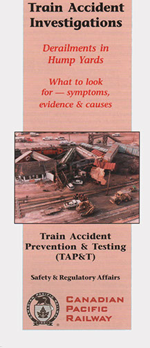
CP Rail developed a series of four pamphlets designed to explain the reasons for some derailments, reasons that could show how to avoid such accidents. How to look for possible equipment and track failure in hump yards (where they put the trains together). I used four different colours for the pamphlets, but kept the same design to show these pamphlets were all part of a series. Created in CorelDRAW.
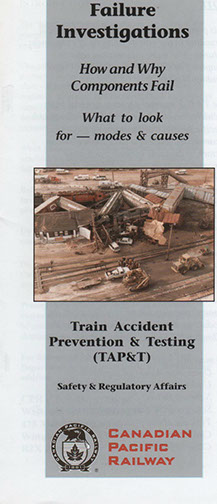
CP Rail developed a series of four pamphlets designed to explain the reasons for some derailments, reasons that could show how to avoid such accidents. How to look for possible equipment failures on the road and in yards. I used four different colours for the pamphlets, but kept the same design to show these pamphlets were all part of a series. Created in CorelDRAW.
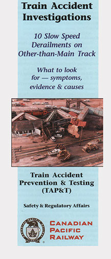
CP Rail developed a series of four pamphlets designed to explain the reasons for some derailments, reasons that could show how to avoid such accidents. How to look for possible equipment and track failure in sidings and spurs. I used four different colours for the pamphlets, but kept the same design to show these pamphlets were all part of a series. Created in CorelDRAW.
CP Rail developed a series of four pamphlets designed to explain the reasons for some derailments, reasons that could show how to avoid such accidents. How to look for possible equipment and track failure on the main line. I used four different colours for the pamphlets, but kept the same design to show these pamphlets were all part of a series. Created in CorelDRAW.
When CP Rail was building a tunnel through Cheops Mountain and Rogers Pass, all forms of publications would need to have a "layout" first. This gave the client an idea of what was to be created, whether photos or illustration were to be used. Destiny's Road was to be a video chronicling the building of the tunnel. Pen and ink on drawing paper.
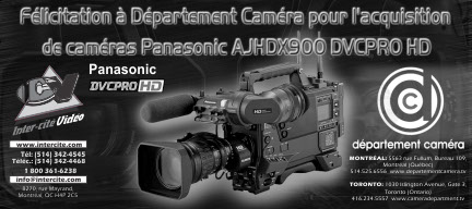
The Inter-City Group branched into security systems, offering hi-tech digital cameras to help monitor banks, institutions, airports, and the like. In my design, I highlighted the brand name to make it immediately recognizable and implemented several images from possible site applications. Assembled in Photoshop and CorelDRAW.
Hôpitel wanted to give something back to customers who used their services, they asked for the creation of three distinct bilingual cards that could be given to patients in the hospital. I used an image from the Hôpitel Corporate Profile I created for the band across the top and different flowers for the background to the message. I utilized the same flower on the left to help tie all the cards together. Created in CorelDRAW.
Hôpitel wanted to give something back to customers who used their services, they asked for the creation of three distinct bilingual cards that could be given to patients in the hospital. I used an image from the Hôpitel Corporate Profile I created for the band across the top and a Calgarian sunset background to the message. I utilized the same flower on the left to help tie all the cards together. Created in CorelDRAW.
PatientLogix required 3 brochures introducing the connections between patients, clinicians and health media.
PatientLogix required 3 brochures introducing the connections between patients, clinicians and health media.
PatientLogix required 3 brochures introducing the connections between patients, clinicians and health media.
Hôpitel wanted to give something back to customers who used their services, they asked for the creation of three distinct bilingual cards that could be given to patients in the hospital. I used an image from the Hôpitel Corporate Profile I created for the band across the top and a nature image as background to the message. I utilized the same flower on the left to help tie all the cards together. Created in CorelDRAW.
CP Rail created the General Operating Instructions or GOI for short to have all the rules and regulations at the fingertips of the conductor and locomotive engineer. To make the book look more accessible, I created the cover to be more colourful than the standard B&W rulebook. Assembled in CorelDRAW.
CP Rail created the General Operating Instructions or GOI for short to have all the rules and regulations at the fingertips of the conductor and locomotive engineer. To make the book look more accessible, I created the cover to be more colourful than the standard B&W rulebook. Each new effective date, I created a new cover as to highlight that it was a newer edition. Assembled in CorelDRAW.
CP Rail created the General Operating Instructions or GOI for short to have all the rules and regulations at the fingertips of the conductor and locomotive engineer. To help keep the thickness of the book to a minimum, the book was separated into two distinct books, each containing rules that were specific to either conductor or locomotive engineer. Assembled in CorelDRAW.
This two part golf invitation for the two railways was designed round like a golf ball. This unique shape was to help the recipient remember the social outing. Die-cut round and air brush on illustration board.
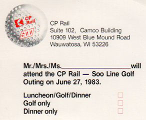
The response card to the two part golf invitation for the two railways. Assembled in CorelDRAW.
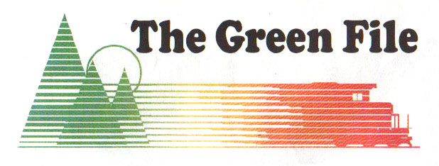
CP Rail News, in an effort to be environmentally responsible, created a new column called the Green File. I used trees, the sun and a locomotive to show the relationship of all three. Green for growth, yellow for solar power and the Company red, these colours were also used on the full printed page that the column ran on. Created in Adobe Illustrator.
Hôpitel Corporate Profile. Logo and text below are silver foil, Pantone colour for extrude on glossy card stock. Created in CorelDRAW.
Inside sample of Hôpitel Corporate Profile. Each photo has a silver foil box surrounding it. This profile is available in both official languages. Created in CorelDRAW.
Hôpitel needed an illustration for how their educational system worked. Created in CorelDRAW.
Le Groupe Inter-cité Corporate Profile. I assembled images of the products and services the were offered and placed them into the same shape as the ICV logo. Photoshopo and CorelDRAW.
Inter-City Video required a price list for their clientele. I showcased the more popular items that were rented. Created in Photoshop.
Inter-City Video required a list of all their products and services. The DVD image on the left showcased all the different media storage devices available to the customer. Created in CorelDRAW.
A simple invitation envelope for an upcoming product show. The vertical "Invitation" helped the envelope stand out from other mail customers would be receiving from other suppliers. Created in Adobe Illustrator.
Collecting data from a derailment or train accident required a specific protocol. I designed this ISROP booklet for CP Rail. The graphic shows all the pieces that must be collected to form the picture of what happened. Created in CorelDRAW.
This inside view of the ISROP manual shows all the rules and protocols that must be followed to present to government officials. The sections are coloured coordinated to external documents as to allow organization of information. Each flap opens up to reveal the pertinent information for evidence collecting. Created in CorelDRAW.
This is a companion piece to the ISROP, it is the Field Guide. Same design style to identify this component is part of the larger package. This Field Guide fits into the ISROP folder. Created in CorelDRAW.
Meditel uses an iCloud server, this brochure, designed for hospital employee consumption, explains how the system works. Each chart shows the different component's functionality and the arrows show what is available in the predetermined packages. Created in CorelDRAW.
Meditel wished to showcase available services included in their Media Studio package. The icons on the bottom help the customer to see what was current. Created in CorelDRAW.
Displayed in hospital, promotional materials advertised the uses of the Meditel Multi-Media Studio. I used a graduated tone to move from top to bottom, helping to accentuate the white and black text. Created in CorelDRAW.
Displayed in hospital, promotional materials advertised the uses of the Meditel Multi-Media Studio. I used a graduated tone to move from top to bottom, helping to accentuate the white and black text. Created in CorelDRAW.
Displayed in hospital, promotional materials advertised the uses of the Meditel Multi-Media Studio. I used a graduated tone to move from top to bottom, helping to accentuate the white and black text. Created in CorelDRAW.
A center spread of Inter-City Video's products and services as placed in the Montreal Film Festival guidebook. Showcasing the top-of-the-line equipment to a film and television producing audience, we wanted to show the awards these products have garnered and the cutting-edge frame count the equipment was capable of. Created in Photoshop and CorelDRAW.
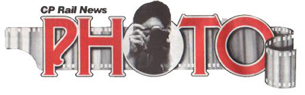
CP Rail News created a photo contest open to all CP Rail employees and family members. I created this logo back when cameras were still using film. Airbrush illustration of the film, hand drawn font and photograph of CP photographer Rick Robinson.
Richard Erlendson's Photo Course in a Day poster. The rich blue twilight sky and dark trees lent themselves to reverse copy. 18"x24" on gloss poster paper. Created in CorelDRAW.
Usage of illustrated Inter-City Video advertisement in the French magazine, Qui-Fait-Quoi. You can see the original painting in the "Illustration" tab of this website.
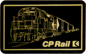
Using an illustration I created f or a portfolio cover, CP Rail created black and white playing cards. The colours used are gold on black, the white version was gold train illustration and black logo on the white background. Pen and ink on illustration board, assembled in CorelDRAW.
An ad for the Qui-Fait-Quoi technical magazine. This B&W ad showcase the high-end editing equipment available to videographers. Created in Photoshop and CorelDRAW.
An eight-page ad for the Qui-Fait-Quoi technical magazine. This B&W ad showcase the high-end editing video cameras available to videographers. Created in Photoshop and CorelDRAW.
Illustration for Genesis Theatre Group's production of Stone Soup. The original illustration is airbrush and acrylic on illustration board.
Illustration for Genesis Theatre Group's production of The Legend of Redwall. The original illustration is airbrush and acrylic on illustration board.
CP Rail ran a seven month campaign called the President's Message. It was created to highlight an important safety concern each month resulting in 7 unique posters. I had to not only design and illustrate the poster, I also had to create the concept and write the copy. We had an internal translation department for the French version. Airbrush on illustration board, the portrait is graphite on illustration board.
CP Rail safety campaign poster, this one focusing on personal safety equipment while playing on our own time. Airbrush on illustration board, the portrait and the snowmobile are graphite on illustration board.
CP Rail safety campaign poster, this one focusing on personal protective equipment (PPE) while on the job. Airbrush on illustration board, the portrait and the employee are graphite on illustration board.
CP Rail safety campaign poster, a review of the posters from the preceding 7 months of messages. Airbrush on illustration board, the portrait is graphite on illustration board.
CP Rail employees are responsible for their own safety glasses and goggles. There are only so many that are CSA approved, we needed to create posters for the different rail yards to show which glasses/goggles were available and from where. Organizing this poster required much planning as the glasses/goggles changed almost weekly, and there were so many of them, I needed to be clear as to the model numbers as the SAP codes in which to properly order them. Created in CorelDRAW.
Safety & Regulatory Affairs department has a responsibility for issuing and enforcing proper safety conduct. Each railway division required different rules as their responsibilities differed from each other, yet some responsibilities overlapped. I create 3 distinct books with similar cover designs in order to show they were all related. The internal pages were loaded with safety icons that identified each rule as being a pinch point, 3-point contact and other relevant issues. Created in CorelDRAW and InDesign.
Office space and rail yards offered a lot of opportunity for thieves and vandals to go unchecked. CP Police ran a campaign that every employee is part of the security team. We were to report, safely, anything suspicious. I used images of four employees from different parts of the railway. A red band across the top represented "warning" and large phone numbers in blue made the contact information readily seen. The opposite side of the brochure is in French.
Back injuries, sore legs, neck issues are common on railway property. Our internal doctors recommended stretching to loosen up the muscles to prepare for the day or fixing rail, moving ties, cleaning switches and the like. I went to the property and photographed a few employees in the positions the doctor recommended. I brought this back, tweaked the text given to me by the doctor and created this brochure. We did a companion piece for Stretch & Prevent in the office. Created in CorelDRAW.
Common mistakes in the rail yard cause serious injuries. CP Rail listed the top eleven short cuts and referenced the violated rules that would lead to injuries. The red hexahedron was symbol that was used through out the campaign. Stickers in that shape were given to employees with one of the eleven rules printed on it. Created in CorelDRAW.
The Railway can't run without its timetables. Each service area has issued a timetable based on the traffic that flows thorough and how long stock would stay in the yard. Each service area got their own colour as to avoid the confusion of receiving the wrong service area timetable. the logo figures prominently as Company branding and the phrase "willingness to obey the rules" was repeated on each table to ensure each employee and customer knew CP Rail was safety conscious. Created in MS Word.
The printed versions of the CP Rail Customer Safety Handbook had an accompanying CD for the customers who opted to load the materials onto their laptops. The design echoed that of the printed version. Created in Photoshop and CoreldDRAW.
When Vancouver hosted the World Expo in 1986, CP arranged to have their own pavilion. Some of the give aways was a bottle of red or white wine. Labels were developed for the wines. Ink and watercolour on board.
PatientLogix, a subsidiary of Patientel developed an interface for hospital patients and doctors. This opening screen directs the patients to the rest of the on-screen options available to them. Created in CorelDRAW.
PatientLogix, a subsidiary of Patientel developed an interface for hospital patients and doctors. Each of the 200+ screens clearly communicate the services offered to the patient, including videos educating them on what to expect during and after surgery, support groups, dietary needs and many others. Created in CorelDRAW.
PatientLogix, a subsidiary of Patientel developed an interface for hospital patients and doctors. Each of the 200+ screens clearly communicate the services offered to the patient, what is expected of them and what is expected of PatientLogix. Created in CorelDRAW.
PatientLogix, a subsidiary of Patientel developed an interface for hospital patients and doctors. Over 300 icons were needed to make this interface readily accessible to both patients and doctors. Above are a few samples that were accessible to the doctors only. Created in CorelDRAW.
PatientLogix, a subsidiary of Patientel developed an interface for hospital patients and doctors. Over 300 icons were needed to make this interface readily accessible to both patients and doctors. Above are a few samples that were accessible to the doctors and patients. Created in CorelDRAW.
PatientLogix, a subsidiary of Patientel developed an interface for hospital patients and doctors. Over 300 icons were needed to make this interface readily accessible to both patients and doctors. Above are a few samples that were accessible to the doctors and patients. Created in CorelDRAW.
Meditel, a subsidiary of Hôpitel developed an interface for hospital patients and doctors. The interactive screens required clear communication, timely information and a clean design. This screen clearly identifies which menu is selected and has an icon with corresponding number to access the desired service. The numbers correspond to the patient's pillow speaker which have these same numbers printed on them. Created in CorelDRAW.
Meditel, a subsidiary of Hôpitel developed an interface for hospital patients and doctors. The interactive screens required clear communication, timely information and a clean design. This screen has a watermark of a computer representing the services available. Each of the coloured "numbers" for the days are correspond with the numbers on the patient's pillow speaker as to chose the quantity of days requested. The back-end automatically tallies up the total. Created in CorelDRAW.
Meditel, a subsidiary of Hôpitel developed an interface for hospital patients and doctors. The interactive screens required clear communication, timely information and a clean design. This call center screen shows the information required to contact those who are responsible. The actual phone numbers have been removed for the sake of this portfolio. Created in CorelDRAW.
Meditel, a subsidiary of Hôpitel developed an interface for hospital patients and doctors. Over 400 icons were needed to make this interface readily accessible to both patients and doctors. Above are a few samples that were accessible to the doctors and patients. Created in CorelDRAW.
Meditel, a subsidiary of Hôpitel developed an interface for hospital patients. These icons are depicting the various movie themes available to patients in hospital. Created in CorelDRAW.
78 - 78
<
>
Retail Design
Samples