RETAIL DESIGN
In-store and Outdoor Signage
Retail design stresses messaging with as little information as possible. A bulk of these samples are from my tenure at Calgary Co-op. When working for a major retail store, there are brand standards that need to be adhered to. The fonts and general samples below are within the required standards.


With the reduction in plastic bags, there was a need to create a re-usable bag. With the popularity of adult colouring books, I designed a coloured panel and a b&W panel, allowing the customer to customize to their tastes. A set of indelible markers were included.
With the creation of a new entity at Calgary Co-op, I designed a pair of socks highlighting the new branding.
A refresh of Calgary Co-op's BBQ chicken offerings. The need to incorporate the branding from two offerings into one band. I used the red background for Founders & Farmers and a white background for the Cal&Gary's chicken.
Highlighting fresh and readily available ingredients in one spot, the concept of "Let's Eat" was to promote accessibility and freshness.
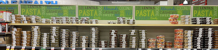
A colourful sent of wordmaps to catch the eyes of the customer.
Signage on the fish bunker highlighting the freshness of the food.
With the need for Covid vaccinations, an "A-Frame" leading customers to our on-line booking services. The Covid bottles had to be manipulated as no images existed with the labels intact.
Signage at the till leading the customers to the vaccination on-line booking services. Several tacts were used, in-store signage, outdoor signage and animation on Calgary Co-op's in-store digital displays.
A floor sticker advertising Calgary Co-op's quality Alberta AAA beef.
In-store promotion for Calgary Co-op's new branded French bread.
Large wall covering and monitor placement. Calgary Co-op's new branding required a large space to advertise itself, plus a digital monitor to display the new products.
With the Best form the West campaign, aisle headers and banners highlighted the new offerings.
The Best form the West campaign required outdoor signage in the parking lot.
A tactic called "Super Ironman" displays can be easily moved within the foodstores. Showing all the different savings events and the easiness for booking flu shots are displayed above.
Posters advertising hiring opportunities are displayed at customer service.
Hanging banners focusing on the Best from the West campaign.
Hanging banners to communicate the location of specialty items.
Simplifying the the ease of locating products in the cooler section required signage with words identifying the location of the product and a watermark to make the sign look friendlier.2
In-store digital displays located at Customer Service and Pharmacy advertise products and services. The on-screen content is fully animated to draw the attention of the customers. These displays came in three formats, horizontal, vertical and two horizontal side-by-side screens. This necessitated the content to be formatted three ways.
Shirts introducing new branding.
In Calgary-Co-op's Wine Spirits Beer, the beer cooler door needed easy identification.
A second beer cooler door ad.
"Social Collection" wines. Each label designed to echo the look and feel as part of a larger family. I designed all the labels in CorelDraw (for ease of cutting out the complicated backgrounds), then imported into Adobe Illustrator to be available for other designers.
Three gift box options were designed for housing the "Social Collection" wines. One-bottle, two-bottle and three-bottle (shown above) versions were created.
Signage promoting rosé. Note I used the same design from the Social Collection rosé bottle.
Social Collection label samples.
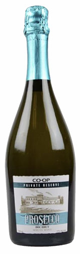
An update of the Co-op Prosecco label.
Out-door bollards advertise the products, both in-store and online.
Ads placed on the Co-op Gas Station pumps required tactics on the gas hose, the gas handle and on a placard atop the pump.
Large outdoor signs on the gas station convenience store. These signs were changed several times a year.
30 - 30
<
>
Corporate Design
Samples